一 : Android自定义控件——自定义组合控件
前面几篇博文介绍了Android如何自定义控件,其实就是讲一下如何“从无到有”的自定义一个全新的控件,继承View或者继承ViewGroup,复写其相关方法,这种自定义控件的方式相对来说难度较大,而且并不是所有需要新控件的情况下,都要这样进行。有很多情况下,我们只要运用好Android给我提供好的控件,经过布局巧妙的结合在一起,就是一个新的控件,我称之为“自定义组合控件”。
那么,这种自定义组合控件在什么情况下用呢?或者大家在做项目时候会发现,某些布局会被重复的利用,同一个布局的XML代码块会被重复的复制黏贴多次,这样会造成代码结构混乱不说,代码量也会增大,各种控件都需要在Java代码中被申明和处理相应的逻辑,工作量着实不小,所以,必须要找到一个合理的“偷懒”的方式,开动脑经去怎么简化以上说的不必要的麻烦。下面看一张图,就一个简单的布局,我们就此图来实现一个简单的自定义组合控件。

从上面的图来分析,我们可以看到,这个布局里面是没有“全新”的控件的,用的都是Android系统原生的控件。熟悉Android界面布局的人,肯定觉得这种布局真是小Case,太简单了,分分钟就可以写完。于是下面就是某一个条目的布局代码:
可以看到,这种布局确实相当的简单。但是,这时候产品经理告诉你,需求改了,我们需要在这个界面再加一个这样的条目,于是你觉得,小意思,Ctrl+C,Ctrl+V,轻松搞定,然后改一下控件的id,在Java代码中findviewbyid(id),加一段逻辑代码,搞完收工。没想到这时候产品又来了,需求改了,这里需要加10个这样的布局,于是你...诚然,这时候再Ctrl+C,Ctrl+V是不合适的,工作量就显得很大了,即使你不嫌麻烦的话,照样做了,你料不到产品会再来,那个给我删掉几个,那个再加上几个,是不是要疯了。
也许,我们可以相出一个偷懒的方法来呢。通过分析上面的布局,可以发现,布局上每一个子条目是不变的,布局完全一样,唯一在变化的是,红色的TextView上的文本随着CheckBox的状态再改变着,而这种变化,我们是否可以想办法抽取到某个方法中呢,答案是肯定能的。我们可以将这种子条目的布局一次性封装到一个Java类中,每次调用这个控件的时候,事先设定各种属性数据即可,这里涉及到了自定义属性了,关于自定义属性,可以参考我的上一篇博客,Android自定义控件——自定义属性,在这里就不在赘述了。分析一下这个属性集该怎么定义,从上面的图片可以看出,控件上需要设置的内容分别是,上面TextView的标题,还有下面TextView的描述信息,且描述信息是根据CheckBox的状态发生改变的,所以这两种状态(true或false)都需要被定义到属性集里去,于是属性集就有了。
在工程下的res/values目录下,新建attrs.xml文件,定义如下属性集:
定义好了属性集了,接下来我们就需要定义一个Java类,来渲染这段布局,解析这个属性集,并且对象提供修改控件状态的方法,已达到复用的效果。问题来了,我们定义的这个Java类需要继承哪个类呢?在这里,我们不必考虑View了,因为这里不是全新自定义控件,不需要onMessure和onDraw去测量去画一个视图。那么ViewGroup呢?我们也不必用这个类,因为这里的布局是给定好的,不需要使用onLayout给子控件设置显示的位置。那么,该继承什么呢?我们可以想象一下ViewGroup的子类是不是可以呢?实现自定义控件的除了继承View和ViewGroup之外,还可以直接继承Android已有的控件进行修改,这个用面向对象的思想,应该不难想象吧。由于,该布局文件用的相对布局RelativeLayout,我们想当然可以自定义Java类去继承这个RelativeLayout,RelativeLayout里提供一些参数和方法方便我们去实现子控件的布局。但是,我们这里直接在子控件布局已经写好了,不需要使用RelativeLayout提供的参数和方法来布局了。所以,导致了,即使不去继承RelativeLayout,而改成LinearLayout,FrameLayout...也是可以的,只要这个布局类是ViewGroup的子类就行。以下是这个自定义组合控件的实现代码:
package com.example.combinationview;import android.content.Context;import android.util.AttributeSet;import android.view.View;import android.widget.CheckBox;import android.widget.RelativeLayout;import android.widget.TextView;public class CombinationView extends RelativeLayout {private TextView tv_title;private TextView tv_desc;private CheckBox cb_status;// 命名空间,在引用这个自定义组件的时候,需要用到private String namespace = http://schemas.android.com/apk/res/com.example.combinationview;// 标题private String title;// 被选中的描述private String desc_on;// 未被选中的描述private String desc_off;public CombinationView(Context context, AttributeSet attrs) {super(context, attrs);// 将自定义组合控件的布局渲染成ViewView view = View.inflate(context, R.layout.layout_combinationview, this);tv_title = (TextView) view.findViewById(R.id.tv_title);tv_desc = (TextView) view.findViewById(R.id.tv_desc);cb_status = (CheckBox) view.findViewById(R.id.cb_status);title = attrs.getAttributeValue(namespace, title);desc_on = attrs.getAttributeValue(namespace, desc_on);desc_off = attrs.getAttributeValue(namespace, desc_off);System.out.println(title + : + desc_on + : + desc_off);// 初始化到子控件if (title != null) {tv_title.setText(title);}if (desc_off != null) {tv_desc.setText(desc_off);}}/** * 判断是否被选中 * * @return */public boolean isChecked() {return cb_status.isChecked();}/** * 设置选中的状态 * * @param isChecked */public void setChecked(boolean isChecked) {cb_status.setChecked(isChecked);if (isChecked) {tv_desc.setText(desc_on);} else {tv_desc.setText(desc_off);}}}扩展:自定义控件组合 / android 自定义控件 / android中自定义控件
代码很简单,首先继承RelativeLayout,复写其构造方法,在构造方法中先渲染布局的视图,然后读取属性集的属性,将默认显示的属性显示到布局上的子控件上即可。另外,还要对外提供一个判断状态的方法isChecked()来判断该控件是否被选中了,提供一个设置状态的方法setChecked(boolean),用来改变状态。PS:为了验证我上面的一段话,读者可以将继承RelativeLayout,改为继承LinearLayout或者继承FrameLayout,运行试试看,也是可以实现的。下面是引用这个自定义组合控件的方法,首先需要在Activity的布局文件中定义出来:
首先在上面定义了四个自定义组合控件,大家可以看到,代码精简多了不是?!需要注意的地方:这里引用了自定义的属性集,所以在布局节点上必须要加上命名空间
xmlns:example=http://schemas.android.com/apk/res/com.example.combinationview其中,example是命名空间的名称,是任意取的,但是必须在控件中引用属性的名称一致,不然会报错。后面的一串是标明属性集的路径,前半部分是固定的,最后一个“/”后面的内容必须是工程的包名,否则报错。
下面是Activity里面的业务逻辑代码,没什么好说的
package com.example.combinationview;import android.os.Bundle;import android.view.View;import android.view.View.OnClickListener;import android.app.Activity;public class MainActivity extends Activity implements OnClickListener {private CombinationView cv_first;private CombinationView cv_second;private CombinationView cv_third;private CombinationView cv_fourth;@Overrideprotected void onCreate(Bundle savedInstanceState) {super.onCreate(savedInstanceState);setContentView(R.layout.activity_main);cv_first = (CombinationView) findViewById(R.id.cv_first);cv_second = (CombinationView) findViewById(R.id.cv_second);cv_third = (CombinationView) findViewById(R.id.cv_third);cv_fourth = (CombinationView) findViewById(R.id.cv_fourth);cv_first.setOnClickListener(this);cv_second.setOnClickListener(this);cv_third.setOnClickListener(this);cv_fourth.setOnClickListener(this);}@Overridepublic void onClick(View v) {switch (v.getId()) {case R.id.cv_first:if (cv_first.isChecked()) {cv_first.setChecked(false);} else {cv_first.setChecked(true);}break;case R.id.cv_second:if (cv_second.isChecked()) {cv_second.setChecked(false);} else {cv_second.setChecked(true);}break;case R.id.cv_third:if (cv_third.isChecked()) {cv_third.setChecked(false);} else {cv_third.setChecked(true);}break;case R.id.cv_fourth:if (cv_fourth.isChecked()) {cv_fourth.setChecked(false);} else {cv_fourth.setChecked(true);}break;default:break;}}}好了,关于自定义组合控件就讲完了,非常简单,但是比较常用。以后在项目用到时,想想实现步骤,自定义一种的组合的控件,用起来确实比较方便,比单纯的复制黏贴不仅高大上,而且提高代码的复用性,简化了代码的结构和减少了代码量。扩展:自定义控件组合 / android 自定义控件 / android中自定义控件
二 : WPF 4 DataGrid 控件(自定义样式篇)
在《WPF 4 DataGrid 控件(基本功能篇)》中我们已经学习了DataGrid 的基本功能及使用方法。(www.61k.com]本篇将继续介绍自定义DataGrid 样式的相关内容,其中将涉及到ColumnHeader、RowHeader、Row、Cell 的各种样式设置。
ColumnHeaderStyle 属性
一般来讲列表头是用户首先注意的内容,那么如何在DataGrid 中设计一个美观的表头呢。我们既可以在<DataGrid>中通过<DataGrid.ColumnHeaderStyle>来全局定义;也可以针对个别列在<DataGrid.Columns>中通过<DataGridColumn.HeaderStyle>定义。
<DataGrid x:Name="dataGrid" ItemsSource="{Binding}" AutoGenerateColumns="False"  SelectionUnit="CellOrRowHeader" IsReadOnly="True">  <DataGrid.ColumnHeaderStyle>  <Style TargetType="DataGridColumnHeader">  <Setter Property="Background">  <Setter.Value>  <LinearGradientBrush StartPoint="0,0" EndPoint="0,1">  <GradientStop Color="White" Offset="0"/>  <GradientStop Color="Yellow" Offset="0.5"/>  <GradientStop Color="White" Offset="1"/>  </LinearGradientBrush>  </Setter.Value>  </Setter>  <Setter Property="Foreground" Value="Black"/>  <Setter Property="FontSize" Value="13" />  </Style>  </DataGrid.ColumnHeaderStyle>  <DataGrid.Columns>  <DataGridTextColumn Header="Name" Binding="{Binding Name}">  <DataGridColumn.HeaderStyle>  <Style TargetType="DataGridColumnHeader">  <Setter Property="Background">  <Setter.Value>  <LinearGradientBrush StartPoint="0,0" EndPoint="0,1">  <GradientStop Color="White" Offset="0"/>  <GradientStop Color="SkyBlue" Offset="0.5"/>  <GradientStop Color="White" Offset="1"/>  </LinearGradientBrush>  </Setter.Value>  </Setter>  <Setter Property="Foreground" Value="Black"/>  <Setter Property="FontSize" Value="13"/>  <Setter Property="Width" Value="80"/>
<Style.Triggers>  <Trigger Property="IsMouseOver" Value="True">  <Setter Property="ToolTip" Value="Sort by Column"/>  </Trigger>  </Style.Triggers>  </Style>  </DataGridColumn.HeaderStyle>  </DataGridTextColumn>  <DataGridTextColumn Header="Age" Binding="{Binding Age}">  <DataGridColumn.HeaderStyle>  <Style TargetType="DataGridColumnHeader">  <Setter Property="Background">  <Setter.Value>  <LinearGradientBrush StartPoint="0,0" EndPoint="0,1">  <GradientStop Color="White" Offset="0"/>  <GradientStop Color="LightGreen" Offset="0.5"/>  <GradientStop Color="White" Offset="1"/>  </LinearGradientBrush>  </Setter.Value>  </Setter>  <Setter Property="Foreground" Value="Black"/>  <Setter Property="FontSize" Value="13"/>  <Setter Property="Width" Value="50"/>  </Style>  </DataGridColumn.HeaderStyle>  </DataGridTextColumn>  <DataGridComboBoxColumn Header="Sex" SelectedItemBinding="{Binding Sex}" ItemsSource="{Binding Source={StaticResource sexEnum}}">  <DataGridColumn.HeaderStyle>  <Style TargetType="DataGridColumnHeader">  <Setter Property="Background">  <Setter.Value>  <LinearGradientBrush StartPoint="0,0" EndPoint="0,1">  <GradientStop Color="White" Offset="0"/>  <GradientStop Color="LightPink" Offset="0.5"/>  <GradientStop Color="White" Offset="1"/>  </LinearGradientBrush>  </Setter.Value>  </Setter>  <Setter Property="Foreground" Value="Black"/>  <Setter Property="FontSize" Value="13"/>  <Setter Property="Width" Value="70"/>  </Style>  </DataGridColumn.HeaderStyle>  </DataGridComboBoxColumn>  <DataGridCheckBoxColumn Header="Pass Exam?" Width="100" Binding="{Binding Pass}"/>  <DataGridHyperlinkColumn Header="Email" Width="150" Binding="{Binding Email}"/>  </DataGrid.Columns> </DataGrid>扩展:wpf 自定义控件样式 / wpf 自定义控件与样式 / wpf datagrid 样式
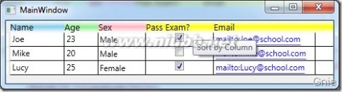
其效果如下图所示,Name、Age、Sex 列会按各自的样式显示。未定义样式的Pass Exam 和Email 列将按<DataGrid.ColumnHeaderStyle>全局定义显示,并且当鼠标移置到这两列上方时会有“Sort by Column”提示信息。
RowHeaderStyle 属性
列表头介绍完了下面再来看看行表头,其定义方式与列表头相同,直接在<DataGrid>中加入<DataGrid.RowHeaderStyle>进行全局定义,见如下代码:
... ... <DataGrid.RowHeaderStyle> <Style TargetType="DataGridRowHeader"> <Setter Property="Content" Value=" ·¤"/> <Setter Property="Width" Value="10"/> <Setter Property="Background"> <Setter.Value> <LinearGradientBrush StartPoint="0,0" EndPoint="1,1"> <GradientStop Color="White" Offset="0"/> <GradientStop Color="SkyBlue" Offset="1"/> </LinearGradientBrush> </Setter.Value> </Setter> <Style.Triggers> <Trigger Property="IsMouseOver" Value="True"> <Setter Property="ToolTip" Value="Select this Row"/> </Trigger> </Style.Triggers> </Style> </DataGrid.RowHeaderStyle> ... ...
效果图:

RowStyle 属性
接下来我们来为行设置样式,使每行的颜色变为蓝色,并且当鼠标移至行上方时,其背景颜色会变为灰色,文字颜色变为白色。
... ... <DataGrid.RowStyle> <Style TargetType="DataGridRow"> <Setter Property="Background" Value="LightBlue" /> <Style.Triggers> <Trigger Property="IsMouseOver" Value="True"> <Setter Property="Background" Value="LightGray"/> <Setter Property="Foreground" Value="White"/> </Trigger> </Style.Triggers> </Style> </DataGrid.RowStyle> ... ...
效果图:

CellStyle 属性
单元格部分我们继续制作一个动态样式,当鼠标点击单元格后,其背景色将变为绿色。
... ... <DataGrid.CellStyle> <Style TargetType="DataGridCell"> <Style.Triggers> <Trigger Property="IsSelected" Value="True"> <Setter Property="Background" Value="SeaGreen"/> </Trigger> </Style.Triggers> </Style> </DataGrid.CellStyle> ... ...
效果图:

扩展:wpf 自定义控件样式 / wpf 自定义控件与样式 / wpf datagrid 样式
三 : Android 自定义组合控件View
要点:
1.定义Layout 文件 如header.xml
2. 继承类FrameLayout(或者ViewGroup, 或者View)
public HeaderBar(Context context, AttributeSet attrs) {
this(context, attrs, R.style.headerTitleBarStyle);
}
public HeaderBar(Context context, AttributeSet attrs, int defStyle) {
super(context, attrs, defStyle);
LayoutInflater.from(context).inflate(R.layout.header, this, true);
TypedArray a = context.obtainStyledAttributes(attrs, R.styleable.HeaderBar);
mLeftButtonBg = a.getDrawable(R.styleable.HeaderBar_leftButtonBackground);
if (mLeftButtonBg == null) {
mLeftButtonBg = context.getResources().getDrawable(R.drawable.back_btn_selector);
}
mRightButtonBg = a.getDrawable(R.styleable.HeaderBar_rightButtonBackground);
if (mRightButtonBg == null) {
mRightButtonBg = context.getResources().getDrawable(R.drawable.refresh);
}
mTitleTextViewButtonBg = a.getDrawable(R.styleable.HeaderBar_titleTextViewBackground);
mTitle = a.getText(R.styleable.HeaderBar_title);
a.recycle();
}
3. 重载onFinishInflate来获取子控件的引用。(www.61k.com)
@Override
protected void onFinishInflate() {
//super.onFinishInflate();
this.mTitleTextView = (TextView) this.findViewById(R.id.tv_header_title);
this.mLeftButton = (Button) this.findViewById(R.id.btn_header_left);
this.mRightButton = (Button) this.findViewById(R.id.btn_header_right);
this.mLeftButton.setBackgroundDrawable(this.mLeftButtonBg);
this.mRightButton.setBackgroundDrawable(this.mRightButtonBg);
if (this.mTitleTextViewButtonBg != null) {
//titleTextViewButtonBg = context.getResources().getDrawable(R.drawable.refresh);
this.mTitleTextView.setBackgroundDrawable(this.mTitleTextViewButtonBg);
}
if (this.mTitle != null) {
this.mTitleTextView.setText(this.mTitle);
}
}
4. 如何使用?
在需要使用自定义控件的layout文件,以包名+控件名作为标签名
注意:如果需要用自己的属性,要加上自己的命名空间:xmlns:xl=http://schemas.android.com/apk/res/com.xxx.abc
规则是:http://schemas.android.com/apk/res/+ 包名
<RelativeLayout xmlns:android="http://schemas.android.com/apk/res/android" xmlns:xl="http://schemas.android.com/apk/res/com.xxx.abc"
android:layout_width="fill_parent"
android:layout_height="fill_parent"
android:background="#f9f9f9"
android:orientation="vertical" >
<com.xxx.abc.view.HeaderBar
android:id="@+id/lan_video_title_bar"
android:layout_width="match_parent"
android:layout_height="wrap_content"
xunlei:title="@string/lan_video_title"
扩展:自定义view组合控件 / 自定义组合控件 / 安卓自定义组合控件
5. 如果你先在eclipse中预览, 千万要注意, 要重启Eclipse,Refresh 资源文件夹。 不然会出现ResourceNotFound导致控件不能预览。
扩展:自定义view组合控件 / 自定义组合控件 / 安卓自定义组合控件
四 : 自定义config和ConfigSections节点
From:
由于最近一个项目的数据库变动比较频繁, 为了减少数据层的负担, 打算采用.net的MVC框架, 使用LINQ对付数据层.
这个框架的web.config文件里出现了configSections section, 这个之前没有留意, 乘着项目不是很急, 顺势把它给搞懂, 花了一下午时间, 终于搞定, 有点心得, 写下来以供面试官翻阅.
asp.net为啥要引用configSections?
因为用户的一些对象, 可能在config里进行配置, 但是config怎么能随便让你添加自己的节点呢! 不行你自己试试, 在任何位置添加任何没有申明的节点, 系统都不会让你通过, 更不会让你去读它了, 当然, 你打算在别的xml文件里添加节点, 然后读出来, 创建对象, 这个没问题.
为了系统能有组织的管理用户的在配置文件里的自定义信息, 就要使用configSections了, 分3步走:
1. 创建一个实现IConfigurationSectionHandler的类
2. 在config文件里添加如下节点:
<configuration>
<configSections>
<section name="NameM" type="LearningConfiguration.NameSectionHandler"/>
</configSections>
<NameM>
<Add key="name1" firstname="Jim" lastname="w1"/>
<Add key="name2" firstname="Chris" lastname="w2"/>
</NameM>
说明: 在configSections下添加一个section子节点, 写好标示名和类型, 然后在紧接这下面实现这个标示名的细节内容,就是我们当初想添加的自己的自定义信息了.
3. 实现IConfigurationSectionHandler唯一的方法: public object Create(object parent, object configContext, XmlNode section), 这里的最后一个参数就是自定义信息那个节点了, 粗体部分. 通过处理这堆信息, 返回你要的对象.
4. 使用这个返回的对象,通过System.Configuration.ConfigurationManager.GetSection()方法.
以下是示例代码:
(NameSectionHandler.cs)

 Code
Code
namespace LearningConfiguration
{
public class NameSectionHandler : IConfigurationSectionHandler
{
#region IConfigurationSectionHandler Members
public object Create(object parent, object configContext, XmlNode section)
{
Dictionary<string, NameManagement> names = new Dictionary<string, NameManagement>();
string key = string.Empty;
string firstName = string.Empty;
string lastName = string.Empty;
foreach (XmlNode childNode in section.ChildNodes)
{
if (childNode.Attributes["key"] != null)
{
key = childNode.Attributes["key"].Value;
if (childNode.Attributes["firstname"] != null)
{
firstName = childNode.Attributes["firstname"].Value;
}
else
{
firstName = string.Empty;
}
if (childNode.Attributes["lastname"] != null)
{
lastName = childNode.Attributes["lastname"].Value;
}
else
{
lastName = string.Empty;
}
names.Add(key, new NameManagement(firstName, lastName));
}
}
return names;
}
#endregion
}
}
(NameManagement.cs)
namespace LearningConfiguration
{
public class NameManagement
{
string _firstName;
public string FirstName
{
get { return this._firstName; }
set { this._firstName = value; }
}
string _lastName;
public string LastName
{
get { return this._lastName; }
set { this._lastName = value; }
}
public NameManagement(string firstName, string lastName)
{
this.FirstName = firstName;
this.LastName = lastName;
}
public string RetrieveFullName()
{
return string.Format("{0} {1}", this.FirstName, this.LastName);
}
}
}
(Default.aspx.cs)
namespace LearningConfiguration
{
public partial class _Default : System.Web.UI.Page
{
protected void Page_Load(object sender, EventArgs e)
{
Dictionary<string, NameManagement> names = ConfigurationManager.GetSection("NameM") as Dictionary<string, NameManagement>;
if (names != null)
{
foreach(string key in names.Keys)
{
NameManagement name = names[key] as NameManagement;
Response.Write(name.RetrieveFullName());
}
}
}
}
}
与以上调用方式一样:
Code
using System;
using System.Collections.Generic;
using System.Linq;
using System.Web;
using System.Web.UI;
using System.Web.UI.WebControls;
using System.Configuration;
using System.Collections.Specialized;
using LearningConfiguation;
public partial class Default4 : System.Web.UI.Page
{
protected void Page_Load(object sender, EventArgs e)
{
Dictionary<String, NameManagement> names = System.Configuration.ConfigurationManager.GetSection("test/aa") as Dictionary<String, NameManagement>;
Dictionary<String, NameManagement>.KeyCollection keys = names.Keys;
foreach (String key in keys)
{
NameManagement nm = names[key] as NameManagement;
Response.Write(nm.FirstName);
Response.Write("<br>");
Response.Write(nm.LastName);
}
}
}
1.为什么需要自定义节点
为了增加应用程序的可移植性,通常网站需要配置一些自定义的节点,例如:文件上传的路径等,再深入的应用,可以定义工厂方法需要创建的类。(www.61k.com]
2.configSections使用方法
configSections节点下定义自定义节点可以帮我们实现我们自己的节点。
首先定义自己的节点,定义方法如下:
<configSections>
<sectionGroup name="section group name">
<section name="section name" type="configuration section handler class" />
</sectionGroup>
</configSections>
定义自己的节点必须在configSections节点。
sectionGroup 元素充当 section 元素的容器。
section 元素将配置节处理程序与配置元素或节关联。由于 ASP.NET 不对如何处理配置文件内的设置作任何假设,因此这非常必要。但 ASP.NET 会将配置数据的处理委托给配置节处理程序,(稍候说明。)每个 section 元素均标识一个配置节或元素。可以在 sectionGroup 元素中对 section 元素进行逻辑分组,以对 section 元素进行组织并避免命名冲突。section 和 sectionGroup 元素包含在 configSections 元素中。
sectionGroup节点属性:
name:必选的 String 属性,这是 group 元素在配置文件的节设置区域中使用的名称。
section节点属性:
name:必选的 String 属性,指定与 type 属性中指定的配置节处理程序关联的配置节或元素的名称。这是该元素在配置文件的节设置区域中使用的名称。
type:必选的 String 属性,指定用来执行如下操作的配置节处理程序类的名称:处理在 name 属性中指定的节或元素中的配置设置。
现在定义好了自己的节点,可以使用该节点了。使用方法如下:
<section group name>
<section name>
<add key="key1" value="value1" />
</section name>
</section group name>
定义好了自己的节点,如何读取节点信息呢?
以下是msdn上的原话:
您可以用自己的 XML 配置元素来扩展标准的 ASP.NET 配置设置集。若要完成该操作,您必须创建自己的配置节处理程序。
该处理程序必须是一个实现 System.Configuration.IConfigurationSectionHandler 接口或 System.Configuration.ConfigurationSection 类的 .NET Framework 类。
节处理程序解释并处理 Web.config 文件特定部分中 XML 配置元素中定义的设置,并根据配置设置返回适当的配置对象。处理程序类返回的配置对象可以是任何数据结构;它不限于任何基配置类或配置格式。ASP.NET 使用该配置对象,以对自定义配置元素进行读取和写入。
上面这段话的意思就是说,我们要定义一个类,这个类要继承自System.Configuration.IConfigurationSectionHandler 接口或 System.Configuration.ConfigurationSection 类。
然后用这个类来处理我们自定义的节点。
我们看到System.Configuration.IConfigurationSectionHandler接口中,只有一个方法:
//创建配置节处理程序
Object Create (Object parent, Object configContext, XmlNode section)
返回值
创建的节处理程序对象。
这个类是干什么用的呢?让我们通过一个例子来看看。
首先,我们新建一个网站项目,并在web.config中加入以下节点:
<configSections>
<sectionGroup name="WebSiteInfo">
<section name="basicInfo" type="ConfigurationSectionTest.WebSiteInfoHandler"/>
<section name="fileUpload" type="ConfigurationSectionTest.WebSiteInfoHandler"/>
</sectionGroup>
</configSections>
<WebSiteInfo>
<basicInfo>
<add key="name" value="huchen's homepage"/>
<add key="version" value="1.0"/>
</basicInfo>
<fileUpload>
<add key="fileUploadPath" value="E:\\MyHomePage\\Web\\Upload\\"/>
<add key="fileUploadSizeMax" value="2M"/>
</fileUpload>
</WebSiteInfo>
以上我们在WebSiteInfo节点下定义了两个节点basicInfo和fileUpload,并定义了节点处理程序类ConfigurationSectionTest.WebSiteInfoHandler,并且随后运用了我们定义的节点。
我们来看看节点处理程序ConfigurationSectionTest.WebSiteInfoHandler。
任意建立一个项目,新建一个类,或者直接在App_Code里新建一个类,如下:
并在Create函数中设置一个断点。
namespace ConfigurationSectionTest
{
/// <summary>
///WebSiteInfoHandler 的摘要说明
/// </summary>
public class WebSiteInfoHandler : IConfigurationSectionHandler
{
public WebSiteInfoHandler()
{
//
//TODO: 在此处添加构造函数逻辑
//
}
#region IConfigurationSectionHandler 成员
public object Create(object parent, object configContext, System.Xml.XmlNode section)
{
//这里我们首先返回个hello,并且在此处设置一个断点。看看程序什么时候执行到这。
return "hello";
}
#endregion
}
}
然后在Default.aspx的Page_Load事件处理程序中去访问我们自定义的节点,并在ConfigurationSettings.GetConfig("WebSiteInfo/basicInfo"); 这条语句上设置断点。
protected void Page_Load(object sender, EventArgs e)
{
Object o = ConfigurationSettings.GetConfig("WebSiteInfo/basicInfo");
}
好了,我们启动调试,看到程序首先执行到ConfigurationSettings.GetConfig("WebSiteInfo/basicInfo");这句。
然后执行到ConfigurationSectionTest.WebSiteInfoHandler中的Create函数。
我们再看看这时处理函数中参数的值:
parent为null
configContext 为配置上下文对象。
section 的InnerXml为<add key="name" value="huchen's homepage" /><add key="version" value="1.0" />
按F11继续执行return "hello", 继续执行...
在执行到Object o = ConfigurationSettings.GetConfig("WebSiteInfo/basicInfo")后面的“}“,我们发现o的值为”hello”。
相信您已经明白的差不多了,当读取自定义节点的内容时,程序去执行我们定义的节点处理程序,并把节点中的内容传给Create函数中的参数。然后我们在Create中自己处理节点下的内容,并返回我们格式化后的节点内容给调用者,也就是ConfigurationSettings.GetConfig("WebSiteInfo/basicInfo")。
注意:程序第一次运行的时候可以调试到Create这个方法,第二次运行的时候就调试不到了,这是因为配置文件时缓存了起来.
只有改变了配置文件或者继承自IConfigurationSectionHandler的类才会重新调用.
好,知道这些以后,我们就来完善我们的代码,我们在Create中处理传进来的节点内容。
为了简单起见,我们引入两个类NameValueCollection,NameValueSectionHandler。
NameValueCollection:表示可通过键或索引访问的关联 String 键和 String 值的集合。
NameValueSectionHandler:提供配置节中的名称/值对配置信息。NameValueSectionHandler 这个类也继承IConfigurationSectionHandler
反编译可以看出NameValueSectionHandler 的Create方法把参数section的结果转化成了一个集合,就是NameValueCollection。
那么我们可以在节点处理程序中的Create函数中写如下代码:
NameValueCollection configs;
NameValueSectionHandler baseHandler = new NameValueSectionHandler();
configs =(NameValueCollection)baseHandler.Create(parent,configContext,section);
Return configs;
这样我们就可以这样访问我们的节点了:
string myWebSiteName = ((NameValueCollection)ConfigurationSettings.GetConfig("WebSiteInfo/basicInfo"))["name"];
在Default.aspx的Page_Load事件处理程序中添加如下代码:
string myWebSiteName = ((NameValueCollection)ConfigurationSettings.GetConfig("WebSiteInfo/basicInfo"))["name"];
Response.Write(myWebSiteName);
Ctrl+F5运行,可以看到页面输出了huchen's homepage
五 : iOS中自定义View实现layoutSubviews布局子控件
iOS开发中,- (void)layoutSubviews{}方法及相关方法注意点!!
====
```objectivec
- (void)creatAutoLayoutUSE
{
// 一、layout相关方法
}
```
- (void)layoutSubviews
- (void)layoutIfNeeded
- (void)setNeedsLayout
- (CGSize)sizeThatFits:(CGSize)size
- (void)sizeToFit
- (void)setNeedsDisplay
- (void)drawRect
1.layoutSubviews在以下情况下会被调用/被触发??
----
+ 1、init初始化不会触发layoutSubviews,但是是用initWithFrame 进行初始化时,当rect的值 非CGRectZero时(www.61k.com),也会触发。
+ 2、addSubview会触发layoutSubviews
+ 3、设置view的Frame会触发layoutSubviews,当然前提是frame的值设置前后发生了变化
+ 4、滚动一个UIScrollView会触发layoutSubviews
+ 5、旋转Screen会触发父UIView上的layoutSubviews事件
+ 6、改变一个UIView大小的时候也会触发父UIView上的layoutSubviews事件
####(在苹果的官方文档中强调:####
You should override this method only if the autoresizing behaviors of the subviews do not offer the behavior you want.layoutSubviews, 当我们在某个类的内部调整子视图位置时,需要调用。反过来的意思就是说:如果你想要在外部设置subviews的位置,就不要重写。)
2.刷新子对象布局??
----
####1.什么时候,需要重写??###
+ view是系统的,不需要重写 - (void)layoutSubviews
+ view是自定义的,需要重写? - (void)layoutSubviews
+ -layoutSubviews方法:这个方法,默认没有做任何事情,需要子类进行重写,自定义view时,手动重写,这里面只能写subview的frame限制。
####2.手动调用这个方法,系统默认 我们不能手动直接调用这个方法,这能通过下列两种方式,调用/触发 - (void)layoutSubviews方法####
+ -setNeedsLayout方法: 标记为需要重新布局,告诉系统未来某个时间点异步调用。不立即刷新,但layoutSubviews一定会被调用。
+ -layoutIfNeeded方法:如果,有需要刷新的标记,立即调用layoutSubviews进行布局(如果没有标记,不会调用layoutSubviews)
+ 若需要立即刷新view的frame更改:(同时调用,注意先后顺序)
*先调用[view setNeedsLayout],把标记设为需要布局
*然后马上调用[view layoutIfNeeded],实现布局
+ 在初始化方法init..。、或者view第一次显示之前,标记总是“需要刷新”的,可以直接调用[view layoutIfNeeded]
3.重绘
----
+ -drawRect:(CGRect)rect方法:重写此方法,执行重绘任务
+ -setNeedsDisplay方法:标记为需要重绘,异步调用drawRect
+ -setNeedsDisplayInRect:(CGRect)invalidRect方法:标记为需要局部重绘
- (注意:sizeToFit会 自动调用sizeThatFits方法;
sizeToFit不应该在子类中被重写,应该重写sizeThatFits)
* sizeThatFits传入的参数是receiver当前的size,返回一个适合的size
* sizeToFit可以被手动直接调用
* sizeToFit和sizeThatFits方法都没有递归,对subviews也不负责,只负责自己
* layoutSubviews对subviews重新布局
* layoutSubviews方法调用先于drawRect
* setNeedsLayout在receiver标上一个需要被重新布局的标记,在系统runloop的下一个周期自动调用layoutSubviews
* layoutIfNeeded方法如其名,UIKit会判断该receiver是否需要layout.根据Apple官方文档,layoutIfNeeded方法应该是这样的
* layoutIfNeeded遍历的不是superview链,应该是subviews链
* drawRect是对receiver的重绘,能获得context
* setNeedDisplay在receiver标上一个需要被重新绘图的标记,在下一个draw周期自动重绘,iphone device的刷新频率是60hz,也就是1/60秒后重绘
本文标题:自定义控件点击事件-Android自定义控件——自定义组合控件61阅读| 精彩专题| 最新文章| 热门文章| 苏ICP备13036349号-1